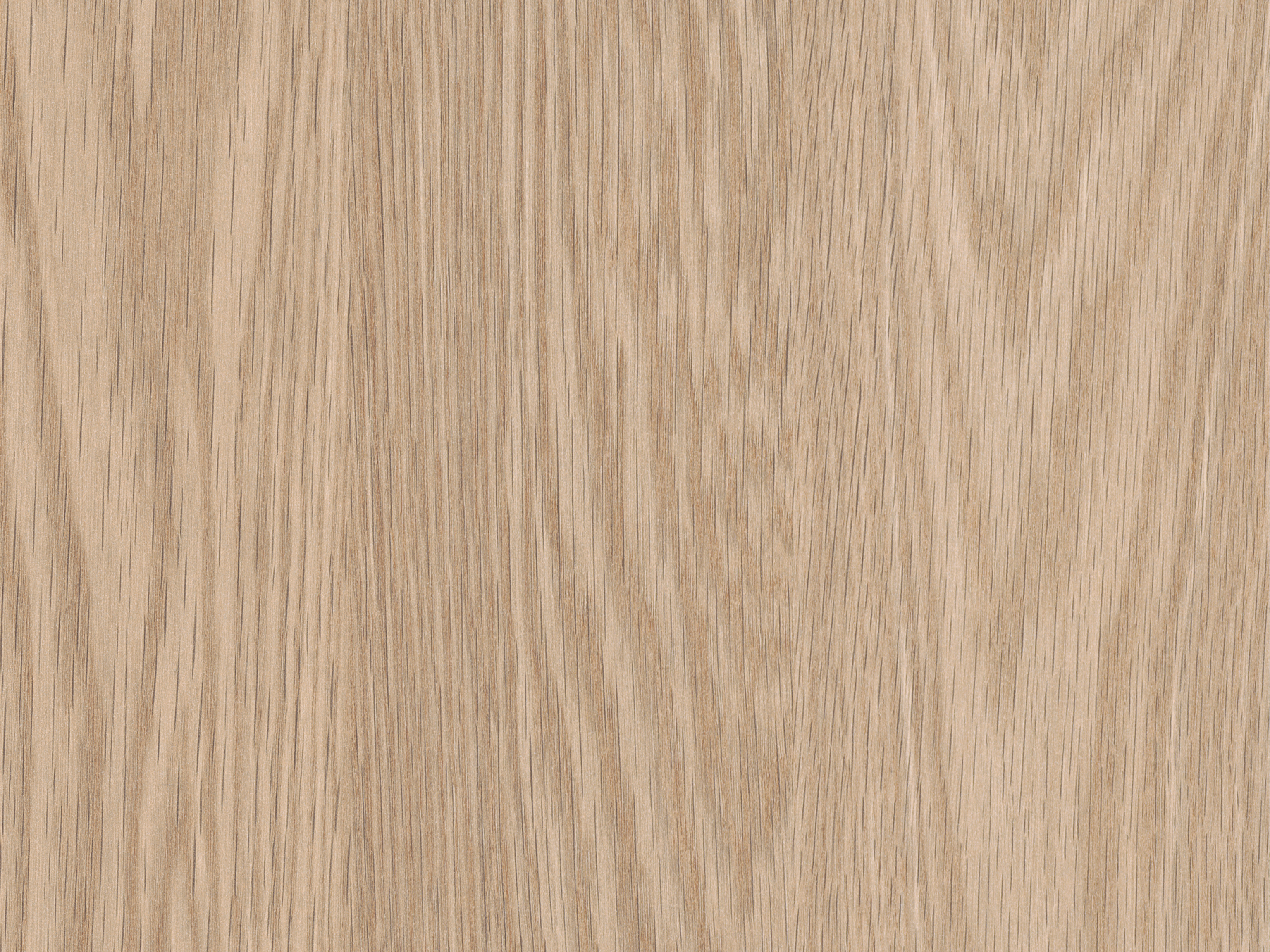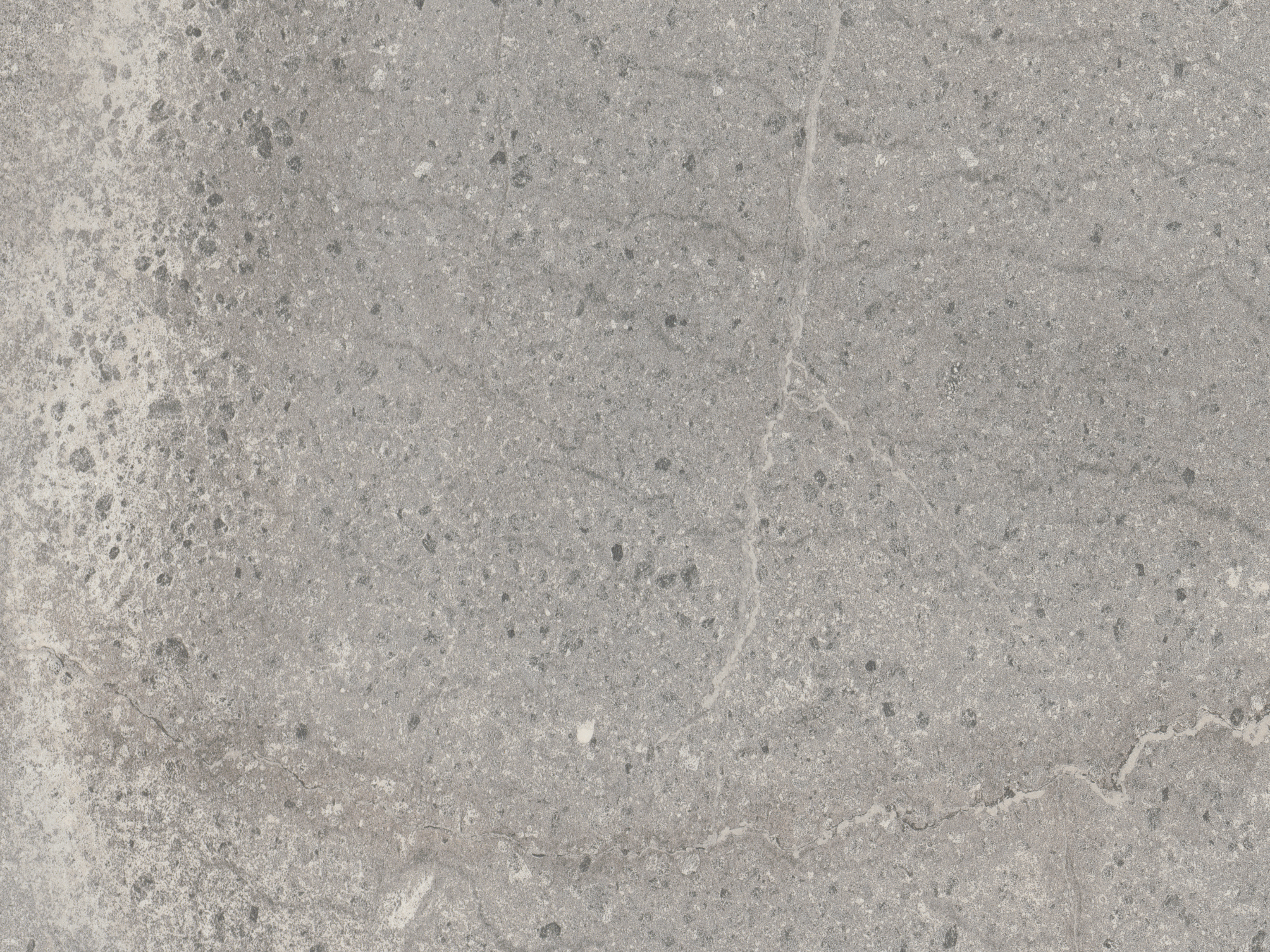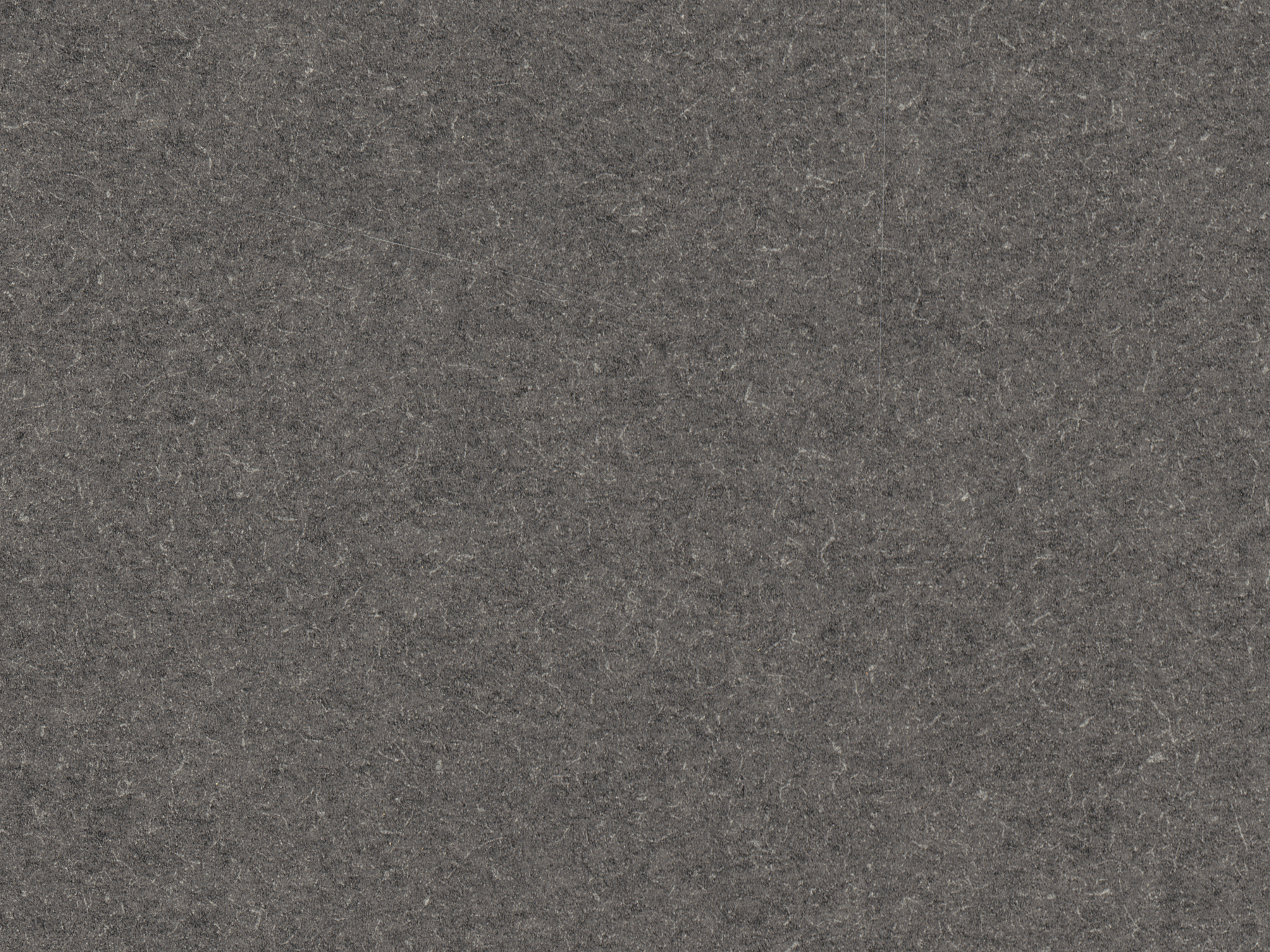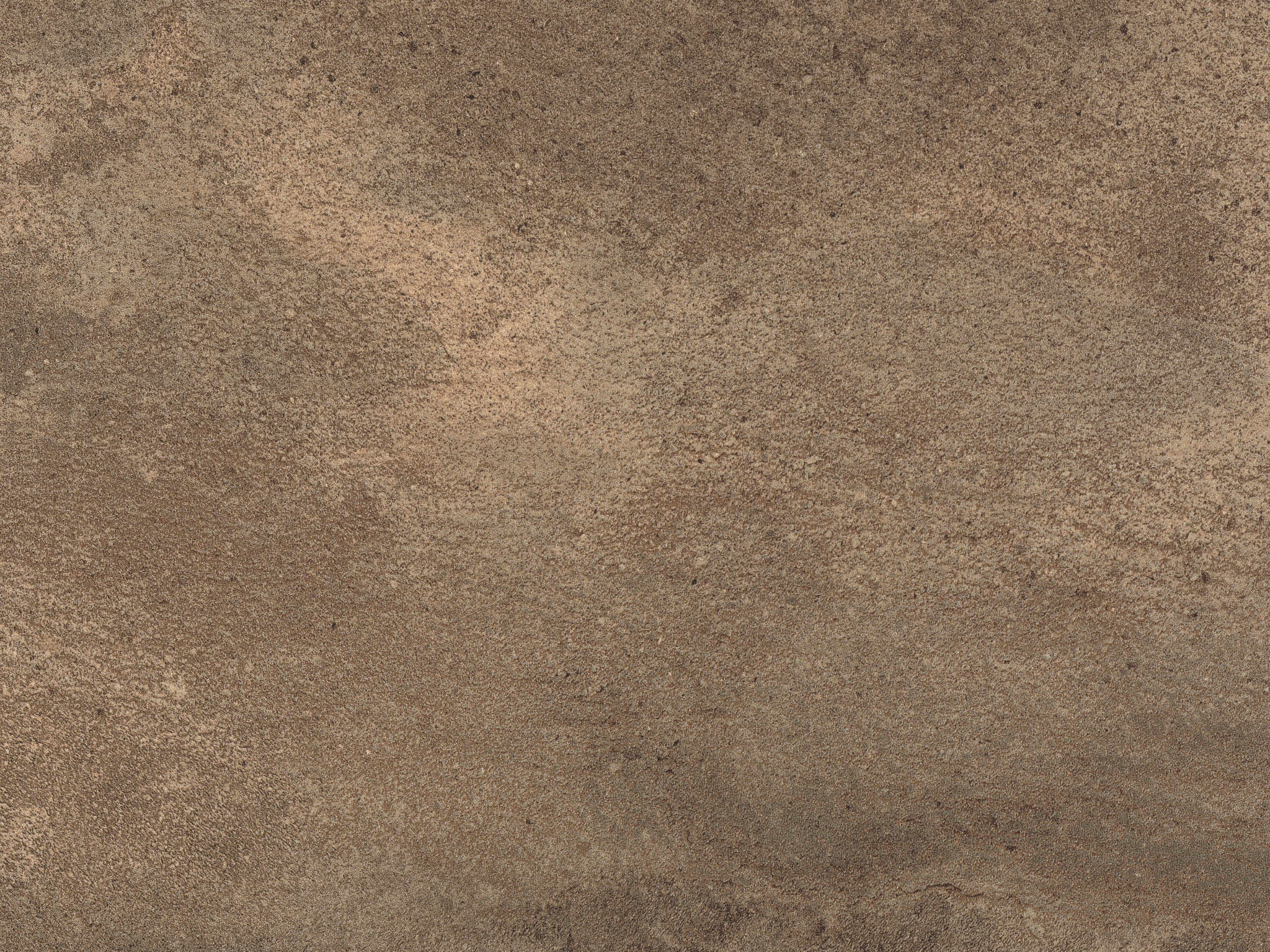
Navigating the EGGER Capsule Concept
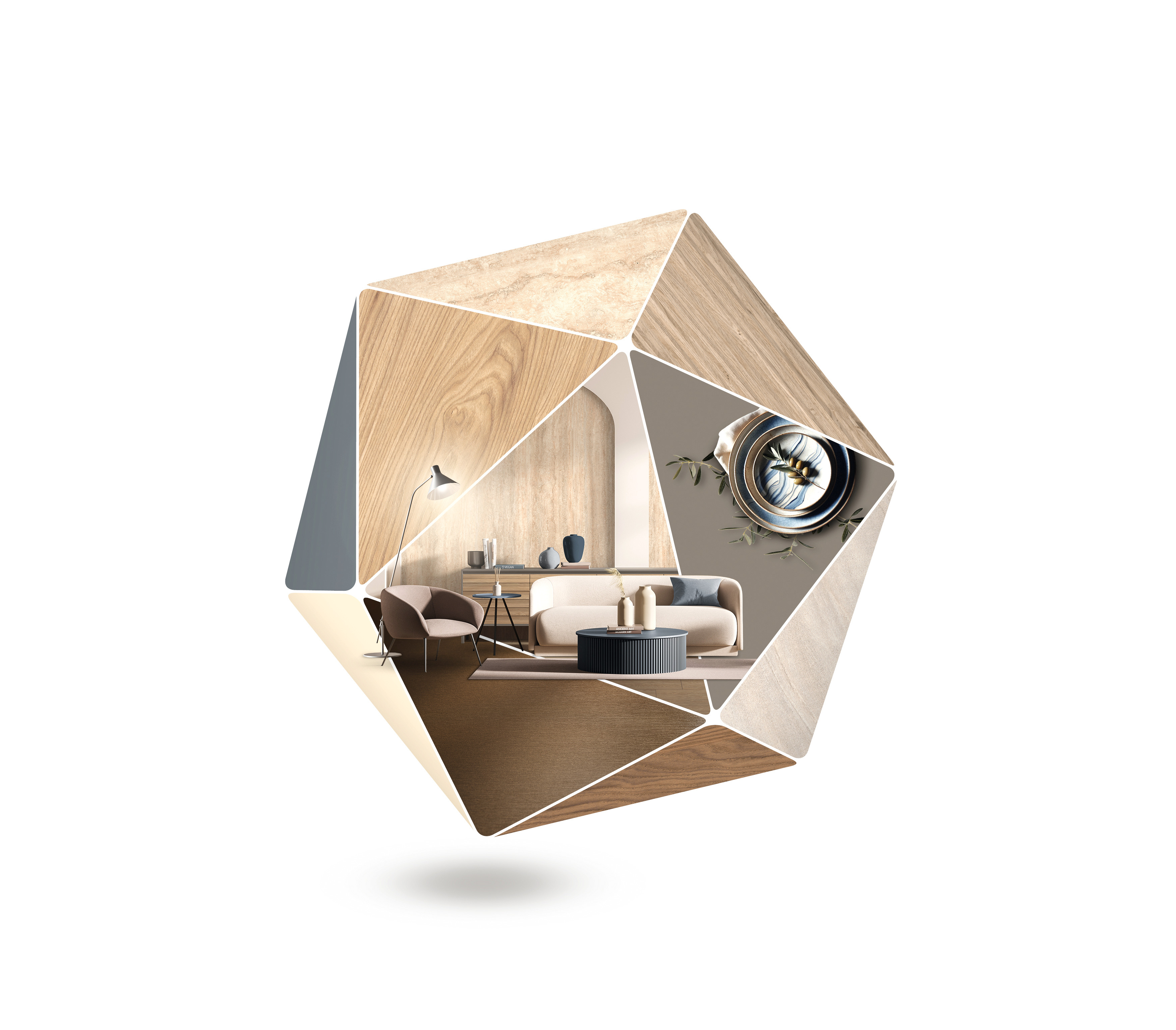
Utilise the comprehensive design solutions of the Decorative Collection 24+ to effortlessly incorporate the latest trends.The Capsule concept offers a growing library of inspiration for a variety of trend topics and application areas. Each Capsule presents carefully chosen decor recommendations from the Decorative Collection 24+, that can be easily combined. Let these Capsules inspire you with the current trends.
How it works:
1. Choose a trend or application area
2. Discover design solutions
3. Easily combine decors
4. Implement interior design ideas
All trend themes at a glance
EGGER Capsule Concept: “Winner” of the German Design Award 2024
The new EGGER Capsule Concept convinced the jury of experts at the German Design Awards 2024 and was decorated with the "Winner" award in the category "Excellent Communication Design - Online Publications".
NEW: Milano - Evolving Harmony
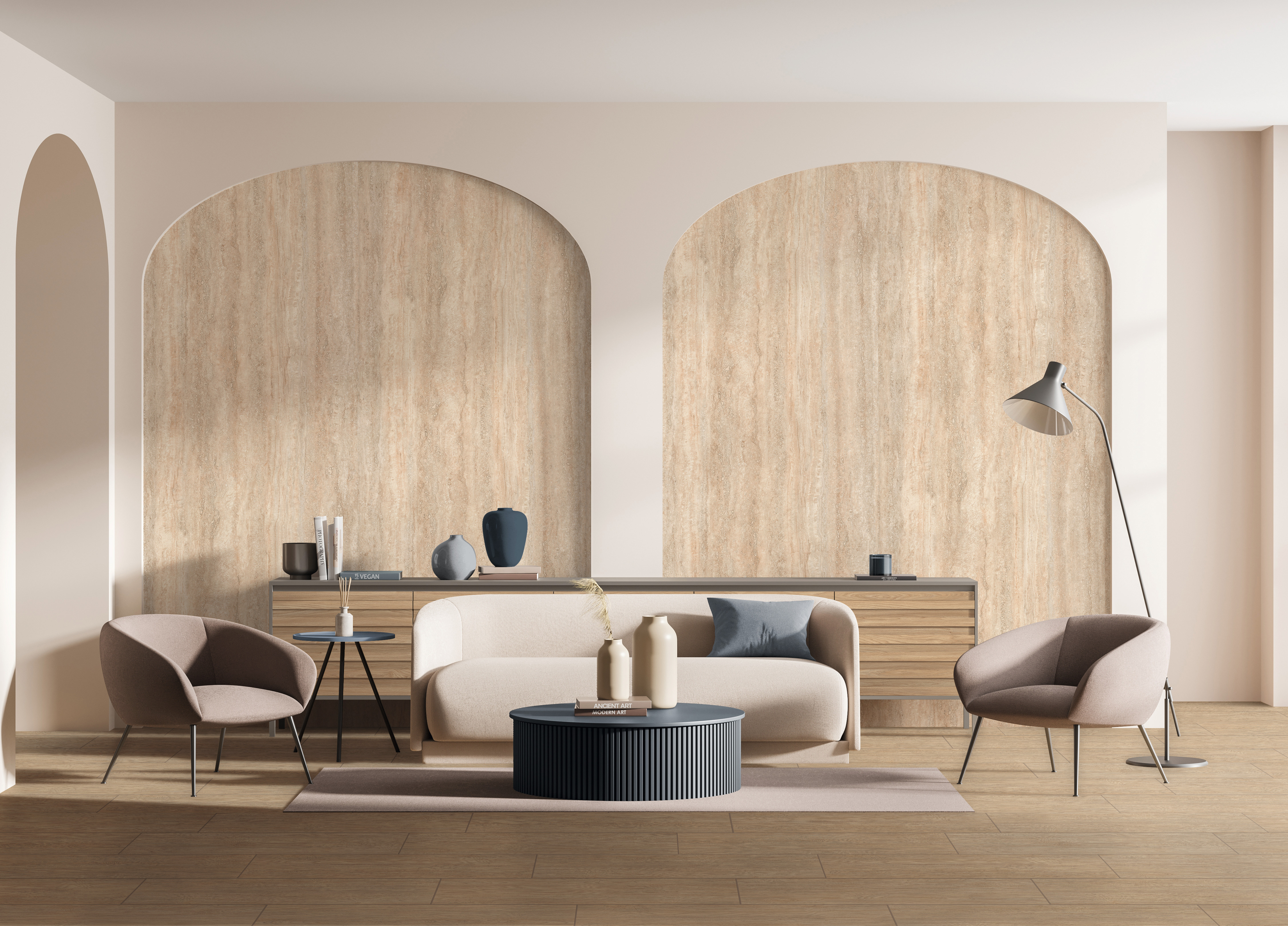
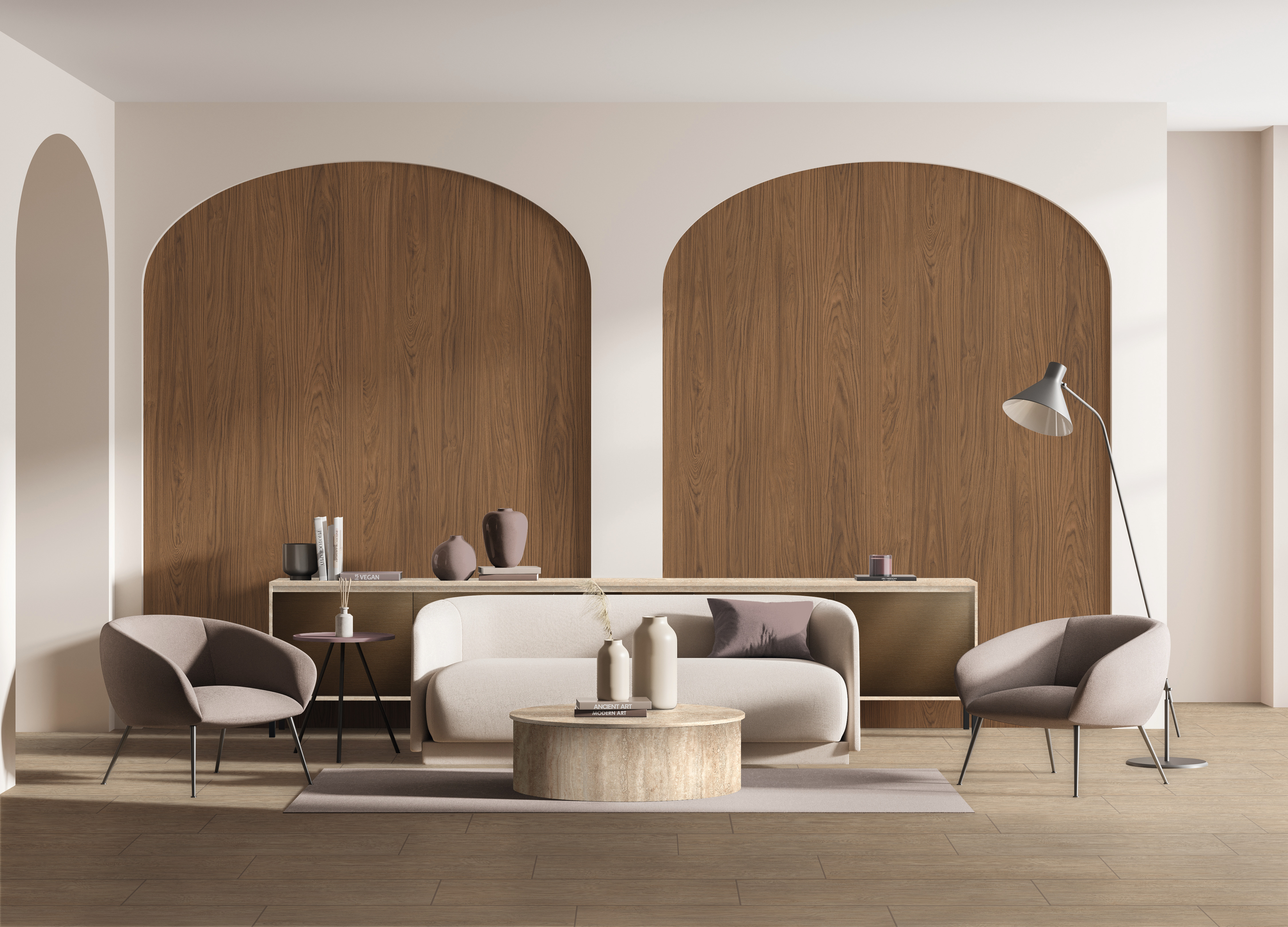
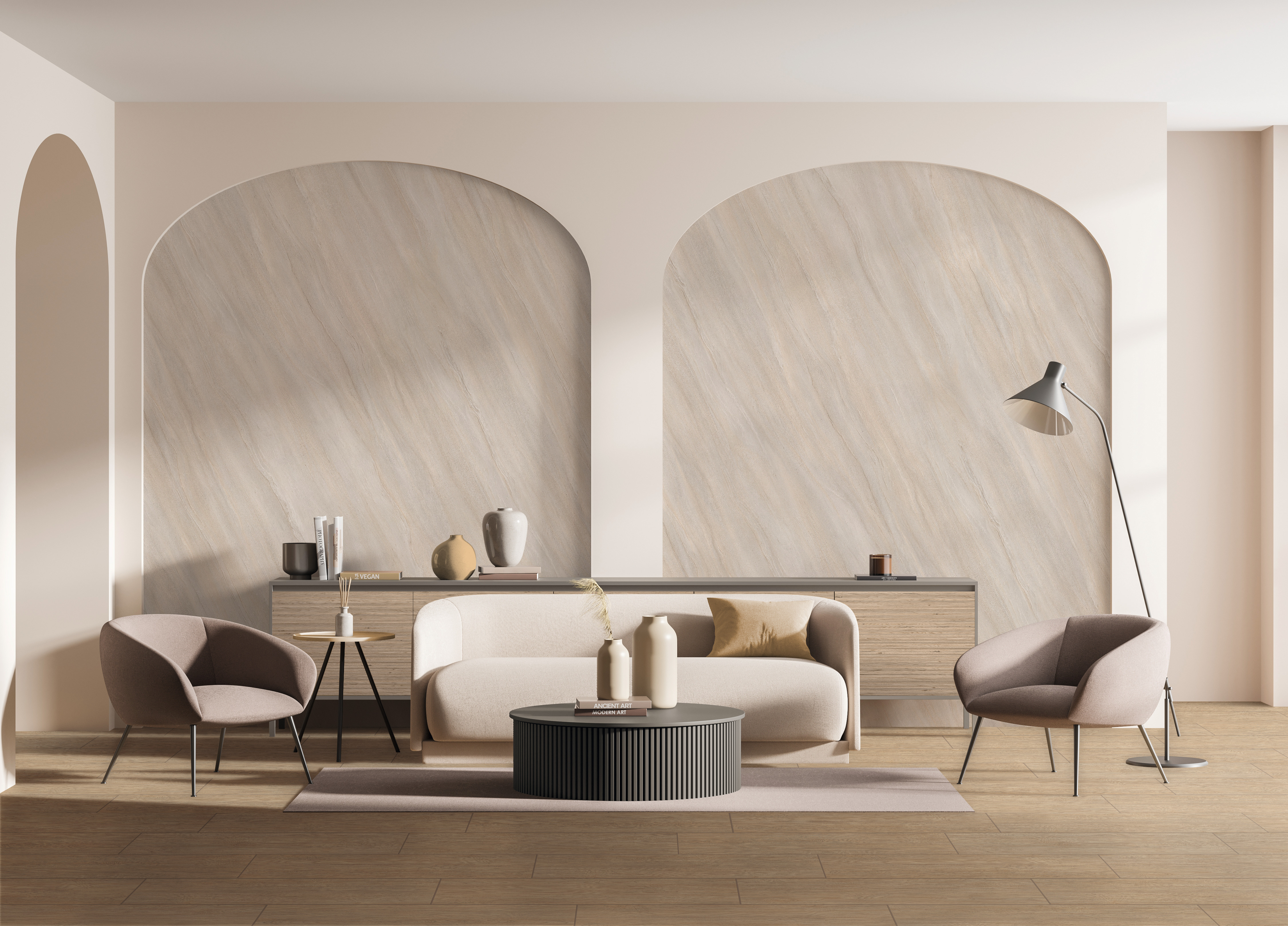
In 2024, the Milan Furniture Fair once again presented a wide range of high-quality materials in a broad spectrum of colours. The harmonious combination of materials (usually tone-in-tone) in the space and in the furniture itself, combined with a well-rounded design, were striking. Classic travertine was a particularly striking material, which was used in flowing colour combinations with neutral uni colours and elegant, authentic wood types. Wood and natural stone were generally used as a warm, natural accent on muted uni colours, with a graphic touch in the linear overlays.
Variety of possible combinations
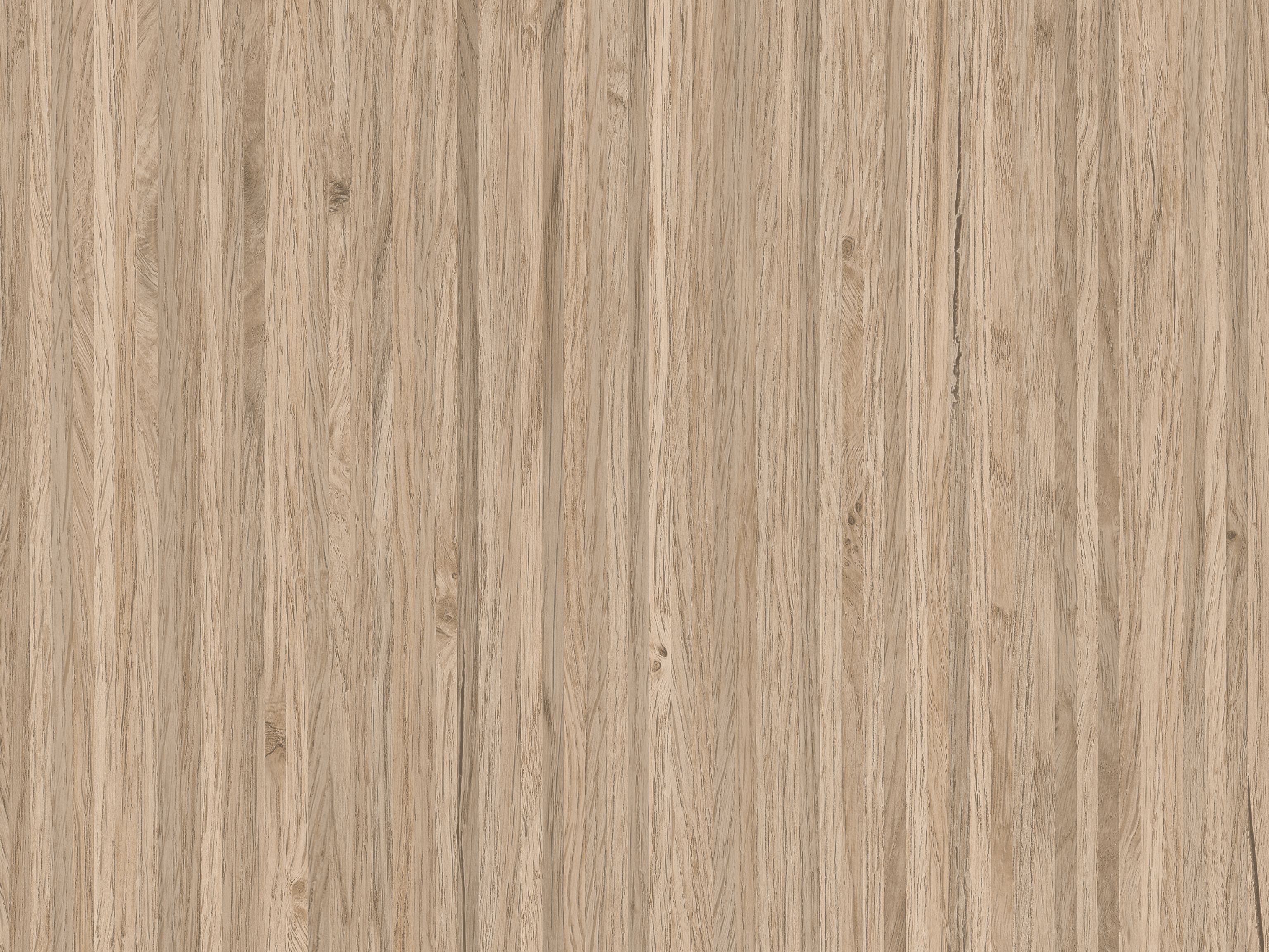
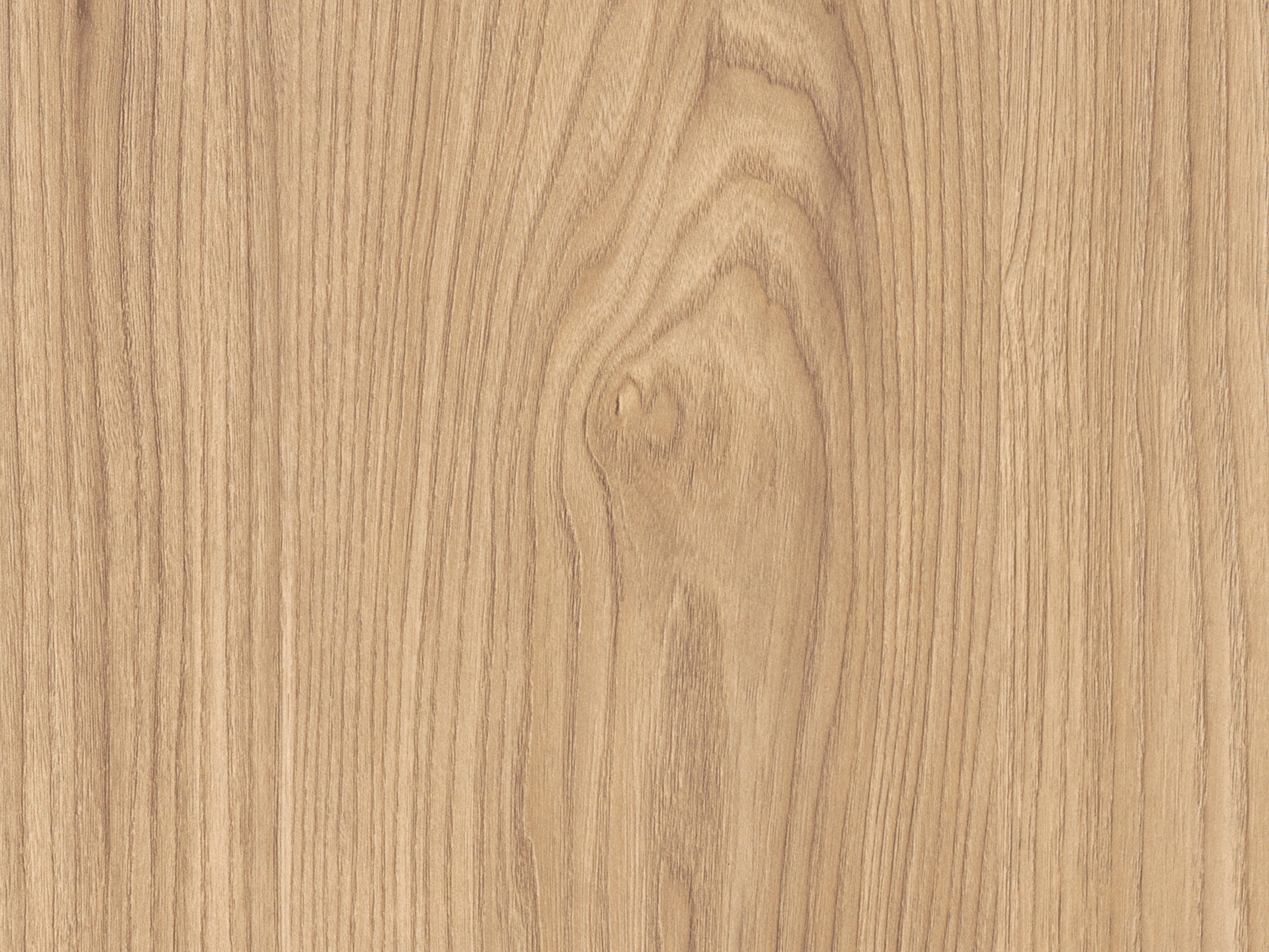
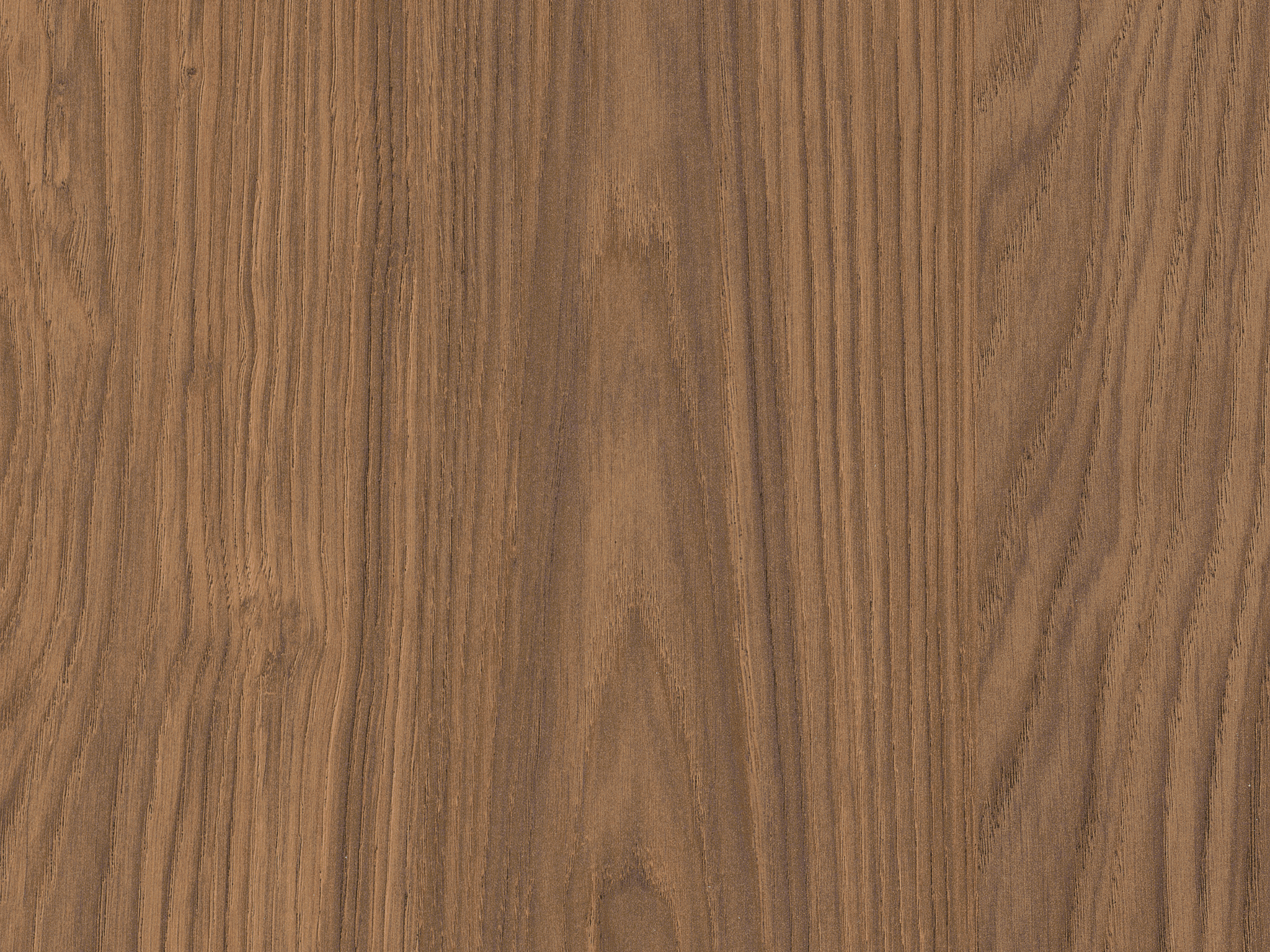
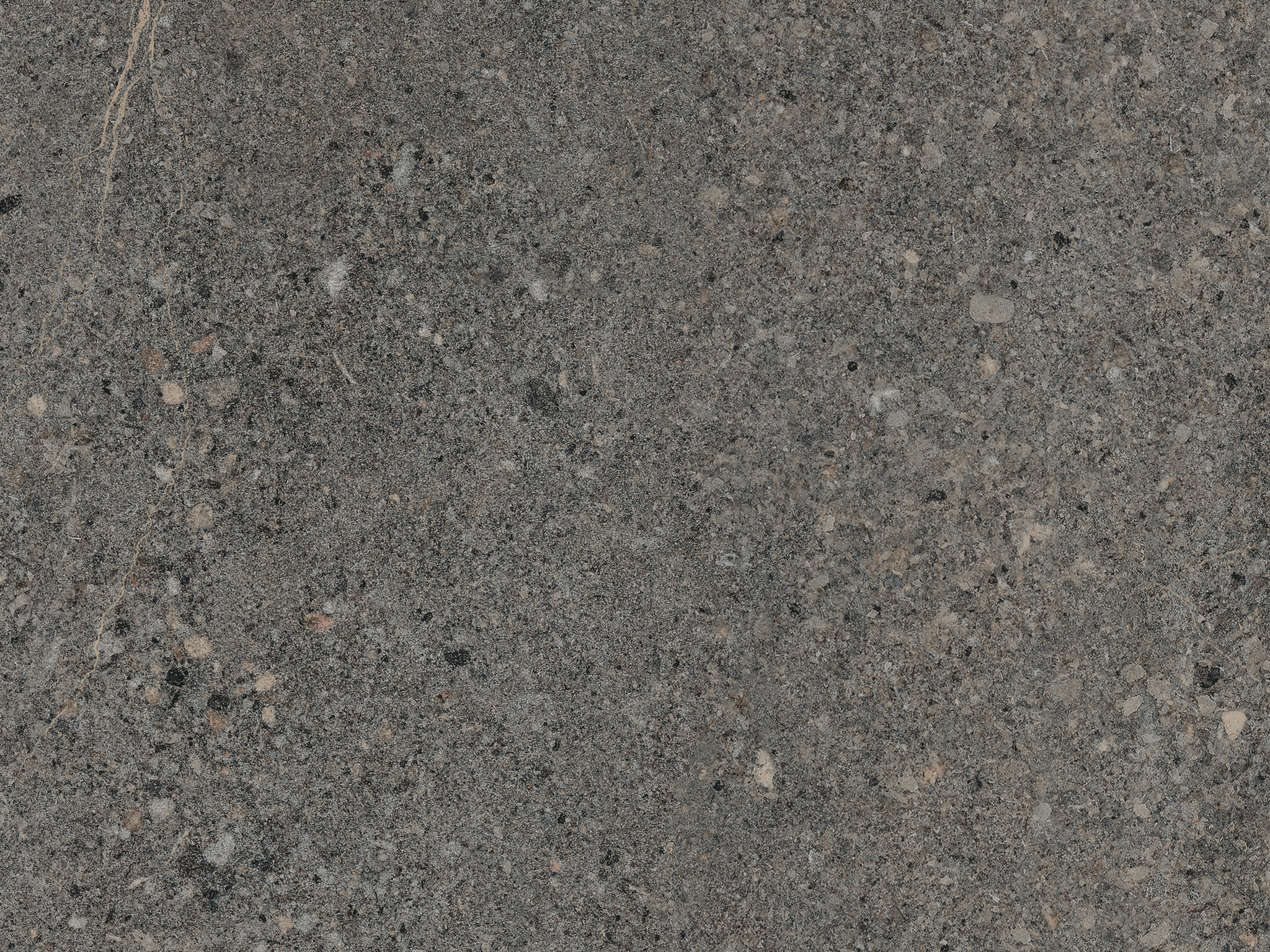
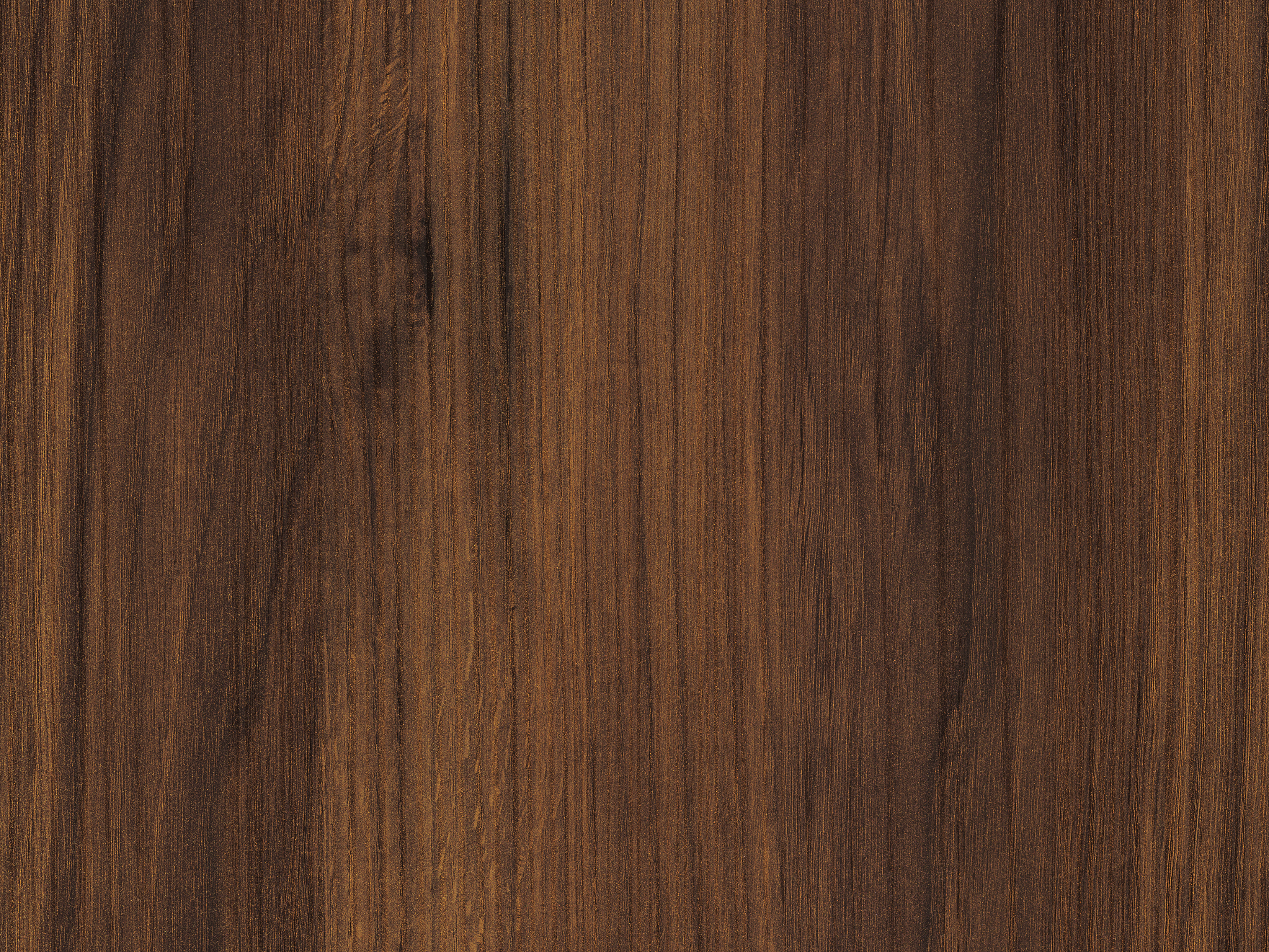
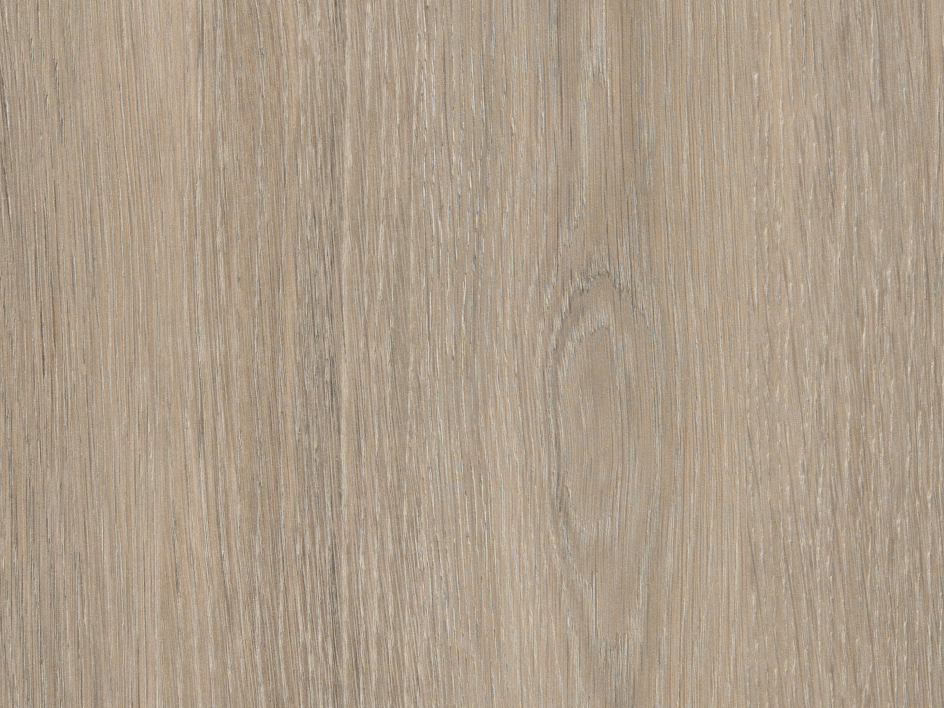
Capsule "Milano – Evolving Harmony" decor selection
Muted Greens
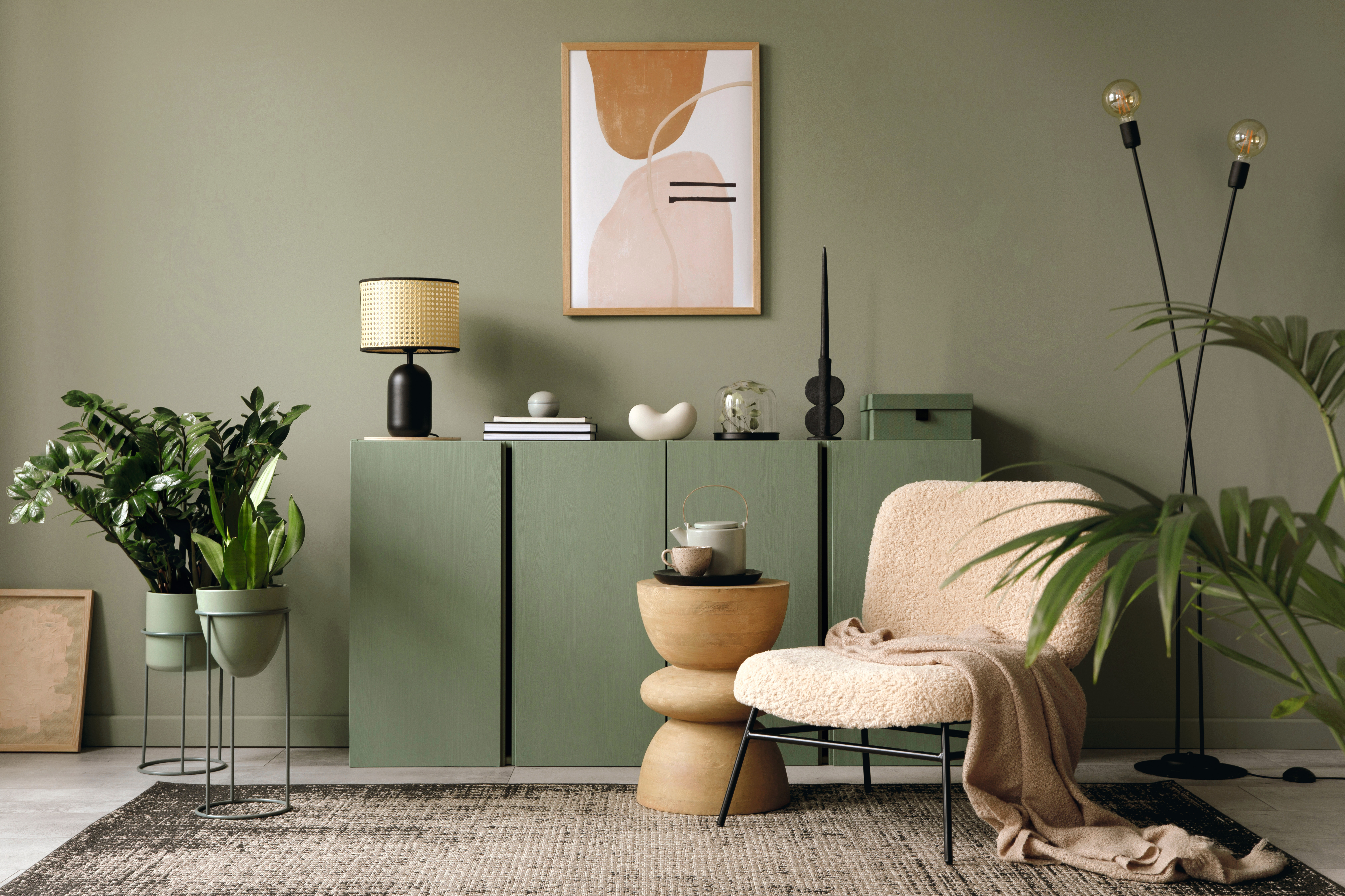
In “biophilic designs”, green is an important colour that is always associated with the megatrend of sustainability. Matt and muted shades of green often appear in many gradations from light to dark. Together, they embody the green diversity of nature, which harmonises particularly well with naturally light wood variants and rough textile effects.
“Muted Greens” Capsule decor selection
Hospitality – Warm Materials
Public interior designs also increasingly require calm and warm materials. Warm wood types with light, natural elements provide naturalness that does not appear too rustic. Exciting metal effects radiate a lot of elegance, especially in public areas such as catering. Stone effects with a warm play of colours, in combination with dark uni colours, can give rooms an impactful overall impression.
"Hospitality – Warm Materials” Capsule decor selection
Style with Value
The relationship with nature is an important design element, especially in public spaces. It represents sustainability, promotes well-being and provides a balance to our increasingly digital areas of life. The latest generation of decorative surfaces impresses with an “authenticity of imitation”. Uni colours that look like paint, stones with a matt-rough feel and wood types with a synchronised surface texture create valuable room designs. They convince with an absolutely natural and authentic look and feel. At the same time, they are durable and resistant.
“Style with Value” Capsule decor selection
Simplicity redefined
Simple, valuable, timeless and functional – this is what increasingly characterises new furniture and interior design. It’s about colours, shapes and surfaces that don’t strive for attention, but together form a harmonious and timeless unity. Upgrading through simplification – that’s what design has to be able to do nowadays. However, this “new simplicity” is not cool and unapproachable, but rather emotional and cosy. This is reflected by our decors in the “Simplicity redefined” Capsule. The wood types are reserved and thus more versatile, but do not lose their naturalness and warmth. Light, muted colour tones give the room a gentle character.
“Simplicity redefined” Capsule decor selection
Design on Top
No other furniture surface needs to be as resistant as the horizontal surface. It also stands out visually, especially as a worktop in the kitchen: It serves as a striking accent or completes the design harmoniously. Reflecting the current trend of “Simplicity redefined”, in which design is becoming simpler, qualitative, timeless and functional, the horizontal surface must be full of character yet also blend smoothly into the room. To achieve this, the decor selection of the “Design on Top” Capsule shows a soft multicolour and thus harmonious combinability.

